Your contact page matters a lot more than you might think.
We've looked at hundreds of B2B websites. Most of the time, the only conversion point on a prospect's website is the contact page. A conversion point is a place where a website visitor enters their details into a form and starts a conversation with you.
Typically, those contact pages have about one to three conversions per 1,000 visitor sessions. That's not good. Despite traffic growth, this is what falling at the final hurdle looks like:
.png?width=862&name=Untitled%20(44).png)
If our scenario sounds disturbingly familiar, then keep reading. Or...
Watch the video
This article is based on one of our popular webinars. We've popped the video and slides here for your viewing pleasure:
Avoid delusional thinking. Contextualise "qualified leads".
This point is quite important for us as inbound marketers.
For example, if you run a B2B IT services company and you get 1,500 or 2,000 visitors a month, you'll likely say to our sales team: 'We get very good, well-qualified leads.' Or, perhaps: 'We convert about half of the contacts we get through our website.'
But of course, by the time somebody has found your website - usually by typing in your name or your company name into Google - they know who you are. They're going straight to the contact page. They're already at the end of the sales journey. They're purchase-ready. In a way, they've fought to get in touch with you.
Of course, you're going to convert more of these leads! So when you're adding other conversion opportunities to your site, like gated offers or webinars, don't hold those leads to the same standard as your contact page leads. It's an illusion — no, a delusion — that doesn't hold up to scrutiny.
The benchmark for website conversions
For a site that's built well with multiple conversion touchpoints — like landing pages, pop-up forms, newsletter signups, and an optimised contact page (more on this, later) — we would expect to see one to two percent of visitors converting. If things are really going well, then that can get to four or even five percent, like one of our clients here:
.png?width=876&name=Untitled%20(45).png)
Wouldn't you like to have ten times more leads and a site that actually works as well as looks good? Even better if you can do things to attract more traffic. That way, you widen the funnel at the same time as optimising your conversion rates. So, at the end, you'll get even more out of your lead generation efforts.
That is the opportunity for conversion rate optimisation, generally, and optimising your contact page, specifically.
Now, let's talk about why most people are not getting the results they should from their contact page. And let's talk about how users perceive it.
Our view of a typical contact page

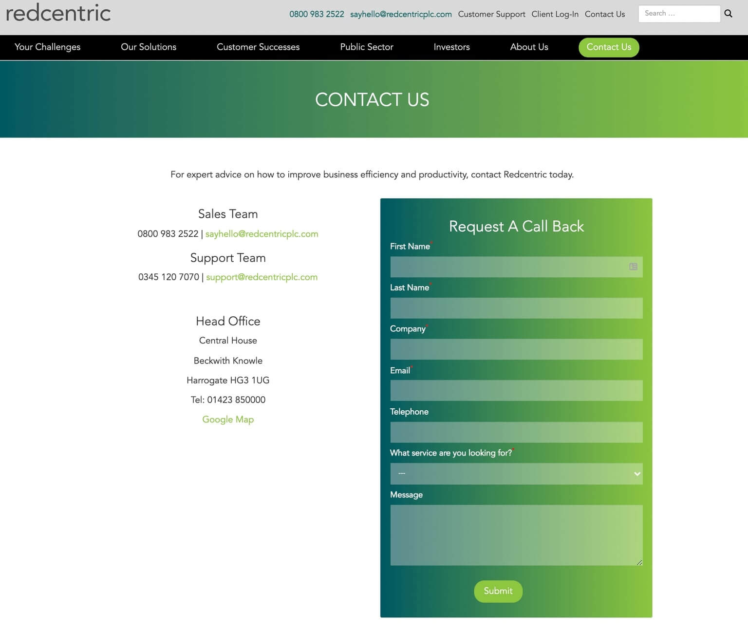
You can go to almost any B2B tech website and see something like this. Phone number, address (usually there's a Google Map that's out of date) and a form. In this case, a big form with loads of fields — a.k.a. barriers to entry.
And, 'What services are you interested in?' makes this form sound very sales-focused. It even mentions the sales team at the top. Redcentric wants people to fill in this form and become customers.
But from the perspective of the visitor, it just looks like, 'If I fill this form in, I'm going to get a million phone calls,' which is a very off-putting experience.
Sorry, we're picking you out as a typical example, Redcentric!
What they should have done
If you're making a 'request a call back' form, you might want to make the phone number field mandatory. Also, consider simplifying your form to:
- Name
- Phone number
- (Optional!) 'What do you want to talk about?'
- Some text saying, for example: 'I'm going to call you back within an hour.'
- GDPR-compliant legal copy
- Conversion-optimised button ('Submit' is rather bland!)
That way, it's really clear what you're asking for, and what you're going to do next.
The worst contact form we've ever made
-1-3-1.jpg?width=1140&name=Untitled%20(47)-1-3-1.jpg)
This is the worst contact page we've ever seen, and we built it. Talk about embarrassing. It was created as part of a consultation for a very large HubSpot marketing enterprise migration and consolidation of 16 different CRM systems from subsidiaries into one system, along with a database of 100,000 contacts.
The client wanted a contact form that had lots of mandatory fields, including full address, phone number, job title, industry, country and which product you're interested in. This is all before you can even send them a message.
Naturally, we pushed back, but they were determined to 'deter frivolous requests.' This is a very big company with multi-100 million pound sales. If they were a shop, it's like they've put a padlock on the front door, saying, 'Ring the owner, we might be here on Wednesday,' instead of opening the door and saying, 'Come on in and buy stuff.'
So there, we've aired our dirty laundry. No shame here.
What your site visitors want
What do site visitors want? A question we'll take, thank you, Mel Gibson.
Here are two ends of the spectrum:
'I want instant action. I want someone to respond right away but I think if I fill in this form, I'm going to get ignored.'
We've all filled in contact forms where we've been ignored, right? So make sure you tell people what's going to happen next, and when. You can even route queries to a ticketing system like ZenDesk or Help Scout, or through HubSpot if you use HubSpot.
Or,
'If I fill in this form, I'm going to get pestered by a salesperson constantly for the next six weeks. I'm going to get spammed to death.'
People (including investors or journalists, not just potential customers) just want a piece of information. Or, they want to buy something. They need a "Buy" button. Some companies force you through this very consultative sales process before they'll even send you a purchase form. It doesn't always make sense to do this.
How to build a high conversion contact page
First, a note on blogs from the long-ago internet.
We have, on Articulate, over 12 months, a lot of traffic, 600,000 sessions plus. A session is somebody using a site for up to 30 minutes, with multiple page views as part of that time. And yes, our conversion rate is below 0.5 percent.
.png?width=880&name=Untitled%20(48).png) Most of the reason for that is about half that traffic - more, even - is people coming to read blog posts that we wrote over the years about all sorts of topics that aren't as relevant to us these days. The blog has existed since 2006 and back then we were writing about things other than B2B technology marketing, usually about writing itself.
Most of the reason for that is about half that traffic - more, even - is people coming to read blog posts that we wrote over the years about all sorts of topics that aren't as relevant to us these days. The blog has existed since 2006 and back then we were writing about things other than B2B technology marketing, usually about writing itself.
So we get a lot of people who come to the site for that information, such as freelance copywriters. We've happy to have them, and we think the content is useful, but it does mean we haven't got the conversion rate that we would like to have. On the other hand, we have got a huge amount of traffic, even during the pandemic — so, we'll take it!
However, that's the conversion rate for the site as a whole. The conversion rate on our contact page is 5.5 percent. So the conversion rate on our contact page is really good. Here's the last 365 days of data:
.png?width=828&name=Untitled%20(49).png)
Some proportion of those people have already filled in a form somewhere else on the site before they filled in the contact page. That reveals something about the way people use websites. They're coming to answer other questions and explore things that they couldn't find elsewhere.
Most of the people coming to your website aren't ready to contact you there. So nurture them, engage with them and get them into your CRM by some other means.
184 new contacts and therefore 3.5 percent of the views converted for the first time on our contact page. This is a really good result. With HubSpot, we can attribute revenue to different marketing activities and calculate an ROI for different pages on the site. Over the last year, for the contact page, the attributable revenue is just under 8,000 pounds. Not a bad ROI for a single marketer's afternoon of work.
We'll go through our contact page as an example, then. Spend a couple of hours, make some or all of these changes, and see if they have an impact:
1. Test your calls to action
-1.jpg?width=489&name=Untitled%20(50)-1.jpg)
First of all, a little bit about A/B testing of buttons and CTAs. We have done a lot of this on other people's sites, so we've got some data and we know what works. Our tests have shown 'Let's Talk' rather than 'Contact Us' in the navigation is better — at least for our audience.
But, 'Contact Us, Today' is in the footer of our site, which has a strong, time-based urgency about it and works well there. These are all subtle psychological nudges.
2. Personalise your greeting
We've also done a little bit of light, non-creepy personalisation. Remember, about 40 percent of the people who come to our contact page are already in our database, because they've already filled in a form somewhere else, so we already know their first name.
On the contact page, if you're in our database, it's going to say, "Hi Matthew." It's a little bit of magic, but it's not super invasive. If you're not in our database or you've got cookie blockers, it still works; it just says, "Hi there." This is done using HubSpot's smart content.
3. Prioritise making it easy to purchase
The first thing that we have at the top of the contact page is an easy-to-find "Buy" button (sort of). We want people to engage with us as potential marketing partners. This sets the tone, and it generates some genuine leads and customers for us. Two customers in the last year, in fact, just from this button. That's thousands of pounds we might have missed out on otherwise.
4. Give the wanderers something to click on
Below that button, we've got some low-stress conversion offers.
We've got other content on the site, like our digital marketing lesson e-mails. You sign up for this, and we automatically send you a weekly e-mail for six weeks, with marketing tips and advice.
Then there's a couple of other pages and ebooks for growth-driven design and keyword optimization. This shows what we know about, and gives something to people who aren't ready to engage and put the hand up for a sales conversation, but will — maybe — take the next step. It's a bit of sales intelligence for us, too, if we see they're interested in SEO before they contact us.
5. Position yourself and provide social proof
Next, we have "anti-objection" copy and positioning copy. That looks like case studies, testimonials and customer logos. We want to attract B2B technology companies. They see Dell and Microsoft and Hewlett Packard logos and they will want to talk to us.
6. Offer people a chance to be wooed
-1-1-1.jpg?width=1542&name=Untitled%20(55)-1-1-1.jpg) The next thing we have on the page is a HubSpot meeting booking tool. This is the pooled availability of our sales and BDR team. If you want to talk to a salesperson, you can come here and you can book up a time. And it'll put it in their calendar, linked to Outlook. It's self-service.
The next thing we have on the page is a HubSpot meeting booking tool. This is the pooled availability of our sales and BDR team. If you want to talk to a salesperson, you can come here and you can book up a time. And it'll put it in their calendar, linked to Outlook. It's self-service.
7. For everything else, there's a form
-1-1-1-1.jpg?width=1536&name=Untitled%20(56)-1-1-1-1.jpg)
OK, yes, we have a form. But we're not after your national insurance number. It's just name, e-mail and comments. This gets routed to our BDR team. So if you're a potential prospect, and you've got interesting questions, this is being read by real people. You'll notice our GDPR text and subtle nudges, like 'business email' not just email, to discourage webmail addresses.
8. Chuck in another CTA, why not?
-1-1.png?width=2244&name=Untitled%20(57)-1-1.png)
Then, there's a newsletter subscription. We get a few submissions on this one. Bear in mind, this is at the bottom of a very long page. It's just there as a final Hail Mary.
9. Add some FAQs
Lastly, Frequently Asked Questions. These allow us to position ourselves and say what we do do, and what we don't do. For example, before the pandemic, a lot of prospective clients were worried by our lack of an office. We've always been a remote working agency, so that was a real source of concern. We wanted to address that head on as you can see in the above image. Usually, people just ask us these question on a call anyway. Oh well!
10. Other suggestions (hey, they might work for you)
We've tried plenty of things, so here are some other options. This isn't a one-size-fits-all kind of operation. You need to do your own testing with your own audience.
- Chatbots (our experience wasn't great)
- Live chat (but you need real people to respond)
- Smart forms, e.g. Typeform
- Phone number tracking
- Press and investor relations pages have special requirements
- Social media 'contact us' and active listening
- See what the Nielsen Norman Group suggests
With all that said, we hope we've inspired you to refresh your contact page. And if you're a B2B tech company in need of marketing, well... go to our contact page. We'd love to hear from you.


-1.jpg?width=400&height=250&name=museum-of-new-zealand-te-papa-tongarewa-Gfsy6hG5z8g-unsplash%20(1)-1.jpg)
