HealthTechs, this is your website wishlist. Gold-standard examples, sifted from the undifferentiated masses. These competitor sites are what you’re up against.
Admire. Learn. Build your to-do list.
Nothing like a bit of healthy competition, right?
1. Huma’s zen paradise

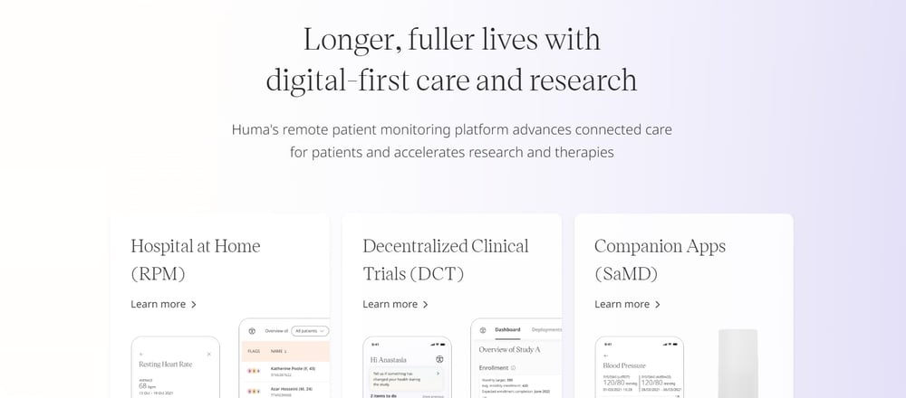
Huma provides, among other things, a digital ‘hospital at home’ for clinicians and hospitals to securely and remotely manage patient data. The company has featured on the Deloitte Fast 50 and is one of Britain’s fastest growing HealthTechs.
What we love
Imagine a spa. A soundtrack is playing; ‘10 hours of birdsong: Volume II’ layered artfully over the burbling of running water. Your shoulders relax, bare feet hit that tiled floor, you breath in a cloud of scented steam and think, “Yeah, this is heaven…”
That’s what Huma’s website feels like.
Against a hypnotically shifting gradient background and swathes of open space, the site elements are delicate yet eye-catching. Huma showcase the product with screenshots and the business with compelling statistics, but it’s not boring. Every now and then an illustration or subtle animation makes an appearance. These touches bring just the right amount of personality.
Our two cents
As marketers, we’d add a blog and more conversion opportunities.
The site is a visual dream. But a website should be a marketing machine. At the moment, it has some company news pieces, one contact page form and a newsletter signup — that’s it.
Huma’s site would benefit from more thought leadership content (gated or otherwise) to turn this gleaming brochure into a work-hard website that brings in leads.
2. Numan’s actionable knowledgebase

Numan is a men’s health organisation aiming to inspire men to take care of their health with its digital platform, tests and medications. You may have seen the stop motion TV ads featuring action hero ‘Dunks’ who prompts Inertia Man to ‘do something’ about his health.
What we love
‘The inaction ends now’ — well, if that doesn’t get you riled up and standing to attention, we don’t know what will (and we’re not talking about their erectile dysfunction offerings).
This website is a masterclass in speaking directly to a targeted audience, in their language, about the things they care about. The design is bold, no-nonsense and reminiscent of an Xbox sale.
The copy is proudly straight-forward, even about the most sensitive subjects, and highly clickable. ‘Fear Nothing Blood Test’ and ‘Weight loss: make this time, the last time’ turn looking after your health into a challenge.
What Numan does right is make it super easy to find information, with one simple ‘Knowledge’ button sitting separate from their organised list of offerings. Plus, most of the articles on their blog are medically reviewed, which gives that content an authoritative sign-off.
Our two cents
A quick check on Google’s PageSpeed tool tells us a few things: this site fails on Core Web Vitals on mobile and has a 46 (out of 100) on page speed. The story on desktop is better, but there’s room for improvement.
Google predominantly uses the mobile version of a site’s content, called mobile-first indexing, so this is something to Numan may want to address in order to appear more favourably in search.
3. Birdie’s friendly bird’s nest

Birdie is a major at-home healthcare technology provider in the UK and beyond, and is on the NHS England Assured Supplier List for Digital Social Care Records.
What we love
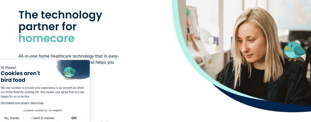
The site isn’t the most out-there design compared to some on this list, but Birdie has made like Articulate and peppered the place with a cute mascot. We can’t help but give props. Every time we saw that bird peering curiously at some text or perching on someone’s shoulder, we smiled. And that cookie pop-up: “Cookies aren’t bird food.” Too cute.
The site is also packed with information, news about the company and conversion opportunities — there’s a cost-benefit calculator on the homepage that is very cool, for example. The navigation makes it easy to find all those resources, too.
Plus, Birdie is a fellow B Corp. The company was B Corp certified just one year after their first product went live. Nice to see this stamp of approval from a third party that requires such rigorous checks and processes. A website without a B Corp badge is missing something vital, in our book.
Read this article by Danny Greenwood, the birdie-bird’s creator <<
Our two cents
As with all of the sites on this list, we’re nit-picking here. The point is, these HealthTech competitors are at the top of the pile for a reason. To write this, we trawled hundreds of HealthTech sites that all looked the same. These ones stood out.
Saying that, Birdie, if you’re reading this, we’d suggest some advanced marketing techniques — we’re talking smart content and personalisation, and testing those forms and pages to optimise conversions. Next level stuff.
Honourable mention: AccessiBe’s accessible toolkit
Before we come to the final HealthTech website on our list, we’d like to take a second to mention AccessiBe. We came across this tool in our research. Their website is fine and all, but the tool itself is a thing of beauty (click the little figure in the corner).
We’ve seen first-hand that HealthTech websites as a whole suffer from poor accessibility from a website user perspective. Dear reader, the irony of this won’t be lost on you.
This tool accommodates for anything from ADHD to sight impairment. Very cool. This isn’t an ad. We’re just geeking out. Moving on…
4. HealthHero’s HubSpot engine

HealthHero is the largest digital healthcare provider in Europe, serving 35 million people and thousands of businesses. It has an award-winning website.
And, HealthHero also happen to be a client of ours.
What we love did
HealthHero had a piecemeal WordPress website. It wasn’t integrated with a CRM. It was slow, hard to update and was hard to navigate. Their team needed to scale their marketing rapidly and launch a new product; their website had to match that ambition.
After we implemented a multi-Hub solution on HubSpot’s Enterprise tier, we replatformed the site, built new pages, and delivered on targeted content and lead optimisation.
Now, we’re proud to say HealthHero has a website fit for this list.
The stand out? That this isn’t some vanity project. This site is a workhorse. It’s integrated with their contact database. Marketers can see the data they need to make the right business decisions. In just one quarter, it reached its year’s target for traffic to the site. And leads are pouring in, with a 2000 percent increase in leads after launch.
See how HealthHero’s marketing machine won a HubSpot Impact Award.
HealthTech website examples — the highlights
Did you make the list?
If not, as Numan would put it: DO SOMETHING. ACT NOW. GO GO GO.
Take these key actions:
- Build a stand-out brand story and communicate it clearly
- Align your (business) vision with your (design) visuals
- Be generously informative, then put your best stuff behind a form
- Speak to your target audience in a specific way that engages those people
- Embed your values on the site: a.k.a. be accessible, be third-party certified
- Use the best tech to create a high-performance website
- Get the right people on the job
Get your website in shape, HealthTechs. Competition’s on.

 Posted by
Maddy Leslie


