Let's talk about how to get more leads through your website. That is, how to get those vital contact details from your site visitors so you can turn them into customers.
More on that in a minute.
This blog is based on our popular webinar on the same subject, which took place in July 2021. You can watch the recording here and download the slides below:
"Brochureware" vs conversion-optimised website
Unless your website is a functional engine that attracts traffic and converts leads, then all you've got there is a brochure. Sorry. For your target audience, you might as well be posting spam through the letterbox. And we all know what happens to those glossy, colourful leaflets.
Marketing is about results. Getting traffic to your site is important, but getting people to convert is even more important.
This is the fundamental question:
Is your website a shop window, a.k.a. a "brochureware" site?
Or, is it an open door? Is it somewhere that invites people in so you start to build a relationship with them? Is it a conversation starter? Is it the place where you start to shape people's thinking with thought leadership? Where you give them tools and content that helps them identify and solve their problem? And, provided in such a way that they think well of you in the process, and maybe start a sales conversation, and so on.
The vast majority of B2B websites are shop windows. A relatively small proportion are optimised to capture leads, even though someone who starts their sales journey on your website is automatically better qualified than a cold prospect. That gives you an opportunity to do something that competitors are not doing.
Here's how we see website lead capture fitting into the 'big picture' of marketing:
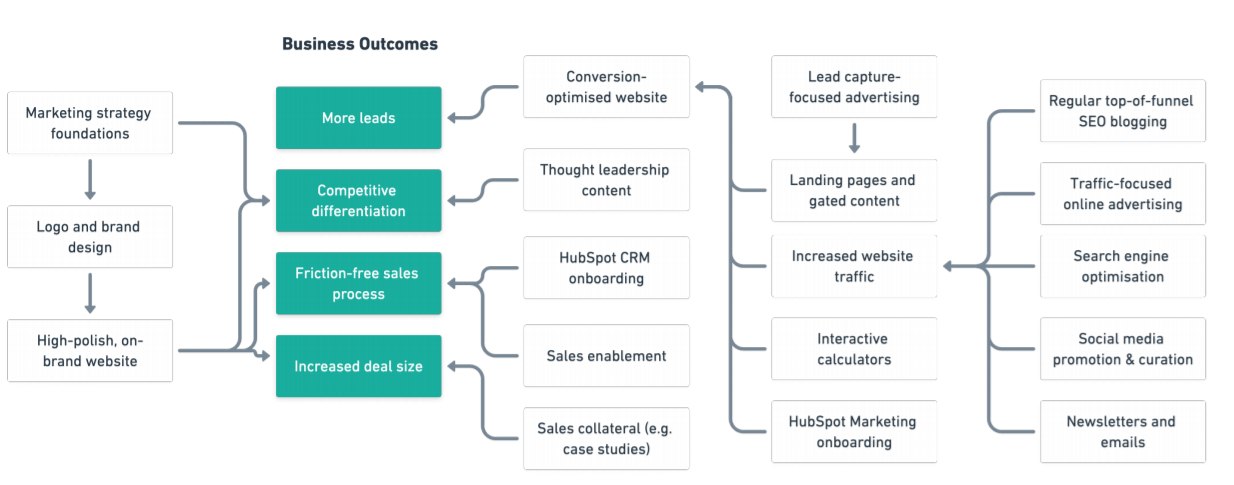
The green boxes represent things we know our clients care about. Getting more leads (and therefore more business) is a really high priority. If we trace 'more leads' back, it requires a conversion-optimised website.
Defining our terms
This is how we measure and define things at Articulate (with the help of HubSpot).
- A session — or "visit" — is one person looking at one or more pages on your site in a 30-minute window.
- An inbound contact is someone who fills in a form on the website, such as a pop-up, calendar meeting link or live chat.
- The website conversion rate is the number of inbound contacts divided by the number of website sessions.
- A lead is somebody who fills in a form and, for us, looks like a suitable fit to be called a 'marketing qualified lead (MQL)'.
- A sales qualified lead is somebody who's an MQL, who engages in a sales conversation and is further qualified by a salesperson.
Conversion rate data benchmarking
From our own tens of thousands of sessions in any given month, our conversion funnel ends up looking like this:
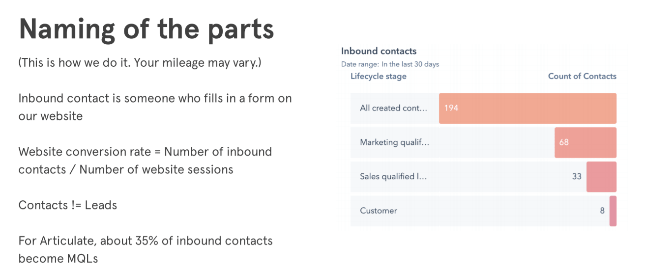
We have a lot of traffic, but much of that is because we have a large blog with content about copywriting that's years-old. Our blog gains an unusual amount of traffic in comparison to leads for those reasons.
Here's some data from our client base:
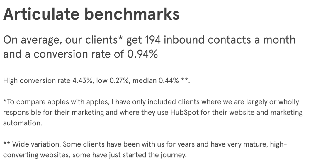
Of our customers, the highest conversion rate benchmark is 4.4 percent. That particular client has a mature marketing offering; some really valuable high profile content; lots of offers, and conversion touch-points. The median reflects a fairly large proportion of our client base, who are coming to us starting from a baseline of zero. They're looking to work with Articulate over 12 to 18 months to increase it.
Looking beyond our own data, here's a graph from Unbounce, detailing conversion rate by sector:
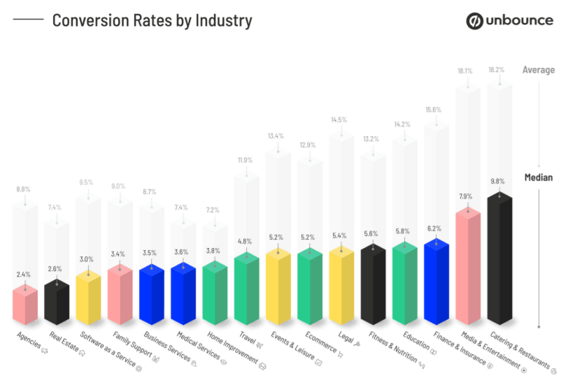
The range here is quite broad, from 2.4 percent to a staggering 9.8 percent, although this will include advertising-driven contacts. At Articulate we're always thinking in terms of inbound, organic and grass-fed contacts, rather than those that are PPC-driven.
Here's some other data from Lusha, which should also be taken with a pinch of salt:
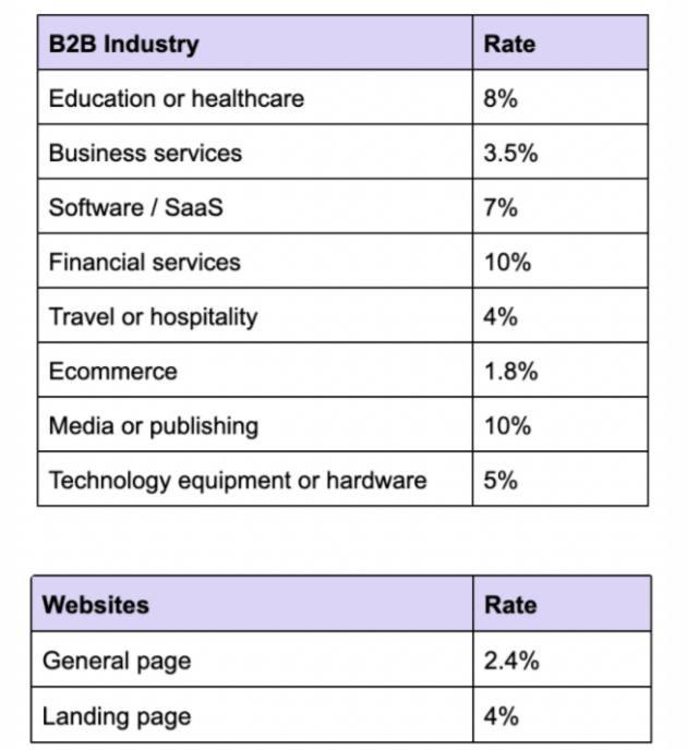
Very broadly speaking, when we're talking to a sales prospect in the B2B tech industry, we set a target between one and two percent of visitors converting as an initial goal. The stretch goal would be three to four percent. When you're starting from 0.01 percent in some cases, that's a very attractive place to be.
So, now that we've got the context out of the way, here's how to make your website generate more leads:
1. Improve your page speed
The first five seconds of page-load time have the highest impact on conversion rates (and SEO). Website conversion rates drop by an average of 4.42 percent with each additional second of load time. So if your site is taking five, six, seven, eight seconds to load, you're losing potential conversions just because your site is slow.
The way to test this is to run GTMetrix on your website, including landing pages. If you're not seeing everything in the green, contact us. We'll fix it!
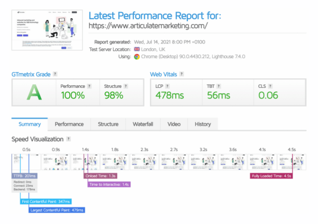
You can see our own performance above. Our site loads three times quicker than HubSpot's, and we're both running on HubSpot CMS.
2. A/B testing
HubSpot makes it very easy to do A/B testing on calls-to-action, landing pages, website pages and emails. Start with CTA buttons. Try A/B testing CTAs in the navigation bar to begin with, as these see a lot of traffic and can present a great quick win.
For example, we tested several variants of 'Get a trial' vs. 'Free trial' and so on for one of our clients. We found the best option had a conversion rate of 11.3 percent compared to just 1.4 percent. That's a massive difference. And that's just words! Imagine what you could do with image CTAs or by testing different designs.
3. Don't neglect the good old fashioned landing page
It's trendy right now to call landing pages "old hat". They're not. They convert very well. Omnisend (via HubSpot) reckons they have a conversion rate of 24 percent, compared to just 4 percent for pop-ups. On Articulate Marketing's website, across all our landing pages, the conversion rate is 25 percent. We have a lot of landing pages, so there are many more that are higher, too.
If you have half a dozen good offers, you'll be in a position to identify the kinds of landing pages that work. Here's our guide to building landing pages:
4. Try webinars
We've found webinars to be a very effective way of doing lead generation.
Now, don't worry if you don't see full attendance during a live transmission. People forget, they get zoom fatigue, they're in the wrong time zone — the list goes on. The real joy of webinars is what you can do with them afterwards, as long as you record them.
It's a really elegant and efficient way of producing content, because from one webinar you get a video, a slide deck and a transcript that you can turn into more content, such as a blog. Like this blog, in fact.
5. Add a PDF download option to long-form blog content
This is another kind of offer that has worked surprisingly well for us. We have some pieces of content that are really comprehensive, such as our 101 B2B Lead Generation tips for inbound marketing, or our ultimate SEO guide. They tend to run over 5000 words.
You can read these for free online. We don't gate them at all. But, you can fill in a form and download them as a PDF, to read offline or on your Kindle. The form on this page is our single best converting offer, even though you can simply scroll and read the rest of the text:
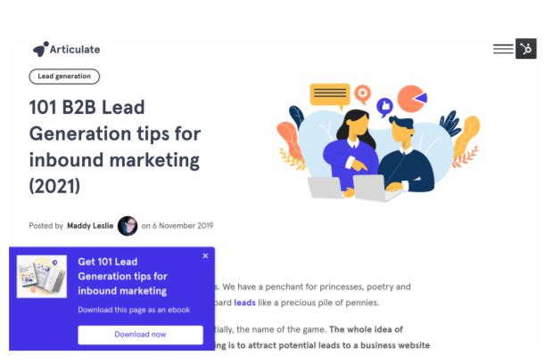
This shows the relationship between the perceived value of the content and form submissions. By making the content available, we're demonstrating the value. So the value exchange we're offering is just: "We'll provide this information in a format that is useful to you."
There are a couple of other interesting offers like this on Articulate. There's one where you sign up for an email course in marketing, and we send you six weekly emails.
6. Switch off AMP
A lot of people who use HubSpot for their website hosting will switch on Google AMP, or HubSpot will switch it on by default for them. Google AMP is Accelerated Mobile Pages, and in HubSpot it applies to the blog. AMP serves a very design-light, quick-to-load experience, which is helpful for mobile. It's a nice idea - in theory.
But, you lose your branding, your menu structure, tracking data and even CTAs. We found that switching off AMP increased our conversion from mobile visitors. To counter the effects of turning it off, we put a lot of work in over the last six months to improve our mobile page speed.
The one caveat here is if you've got a slow website in the first place, the value equation might be a bit different regarding AMP. But if you could optimise your website to serve a good mobile experience and load quickly, this is a no brainer to capture those mobile leads.
7. Add CTAs to all your blog posts
Another hat-pull marketing statistic for you - around 90 percent of the new clients we take on board don't have CTAs on their blog posts.
We recommend including at least one, if not two. If you've got a very long article you might even put two or three CTAs in there. After all, what's the point of having a blog if it's not to bring people into a relationship with you? It's easy enough to do in HubSpot, and there are ways to do it in WordPress, too. (Let us know if you'd like some tips on how to do this. Maybe we'll talk about it in a future webinar!)
8. Try pop-ups
Before we get into this one, yes, we know pop-up forms can be really annoying. Bear with us!
As an example, here's one of our clients, CloverDX:
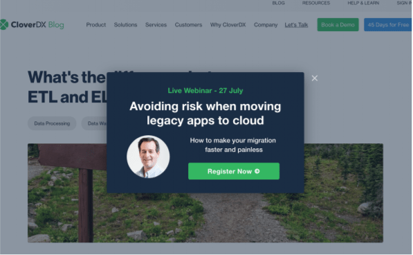
They've got a live webinar pop-up. They, very sensibly — as we do — put some constraints on how long you have to be on the page, and don't show it for 30 days if you close it.
Start simple. Try a a newsletter sign-up. That's better than nothing. Or, even 'Sign up for a newsletter and we'll send you this free guide', which is much more enticing. One of the first, easiest things we recommend new clients do is a pop-up to begin capturing leads.
BONUS: Ensure you have a conversion optimised contact page
We've already talked about optimising your contact page here.
Generally speaking, a contact page with a standard form has a conversion rate of less than 0.1 percent of website visitors. A conversion-optimised contact form can double or even treble your conversion rate on that page, easily.
Again and again we see awful contact forms designed to make sales people happy. These forms have a dozen mandatory fields. They ask for your shoe size and the name of your first-born. So keep your contact forms simple. Give people options for how they want to engage with you. Make your contact page work for the visitor. That's how to get those conversions.
With that final slice of wisdom, we'll leave you to explore the rest of our site. Or, heck, slide into our database by clicking the CTA below:
