Strategic landing pages are used by 68 percent of B2B businesses to acquire leads, according to HubSpot.
When it comes to converting website visitors into tangible leads, your landing pages are your gatekeepers. Get them right, and you could win big. Get them wrong, however, and it’ll likely void all your other digital marketing tactics. That’s money down the drain, folks.
In this article, we explain every step you need to take to create high-converting, attractive and strategic landing pages that get you the leads your business deserves.
This piece used to exist as one of our gated resources, but we've unleashed it from its shackles and now you can read it here, for free. Download the PDF version using this form:
The core components of a landing page
A landing page is a page on your website with a form on it that stands between the visitor and a premium piece of content, such as a white paper, calculator or checklist. The visitor is asked to provide some of their information in order to gain access to this valuable information.
But, how do visitors get to a landing page? And what happens next? It’s about building a user journey, not providing yet another website page with a form on it, hoping people will see it. The idea is to lead people from one step to the next.
CTAs
First and foremost, you need call-to-actions (CTAs).
If a blog post is the first thing your site visitor sees, you want the second thing that catches their eye to be a CTA. These are built to encourage readers to follow on to the next step of the inbound journey. Here's an example:
Think of the hyperlinks that come up in a search engine - that’s like a CTA, leading you onto a web page. However, instead of hosting these links on Google and enticing visitors to click through to your website, CTAs are hosted within blogs or other web pages. Visitors then click through to a specific website page. Their destination? A landing page. The journey doesn’t end there, though.
Thank you pages
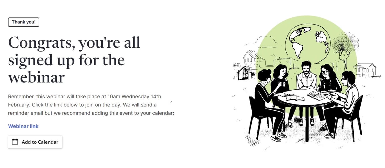
When someone fills in a form on a landing page, they get sent to a thank you page. That is: A dedicated page that, firstly, thanks them (hence the name) for giving you a few bits of information, such as their email address, and secondly, provides the visitor (now a lead) with the gated content you promised. For a more detailed breakdown, here are 10 ways to increase the ROI of your thank you page.
It’s important to note that if you fail to give your lead a valuable piece of content in return for, say, an email address, they’ll feel cheated. And rightly so. We’ve all been falsely promised by a business before, and it stings.
Follow-up email
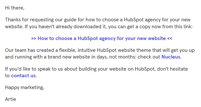
Now that you have your lead, you need to wrap up the visitor-to-lead portion of the inbound journey with a follow-up email.
This email has all the same information as the thank you page (it contains a thank you message and the promised content) but should also include a link to your blog and an opportunity to contact your business.
The importance of landing pages
Before we tuck into how to build a good landing page, we should first revisit the Inbound Methodology, as explained by HubSpot. Here’s a noteworthy diagram:
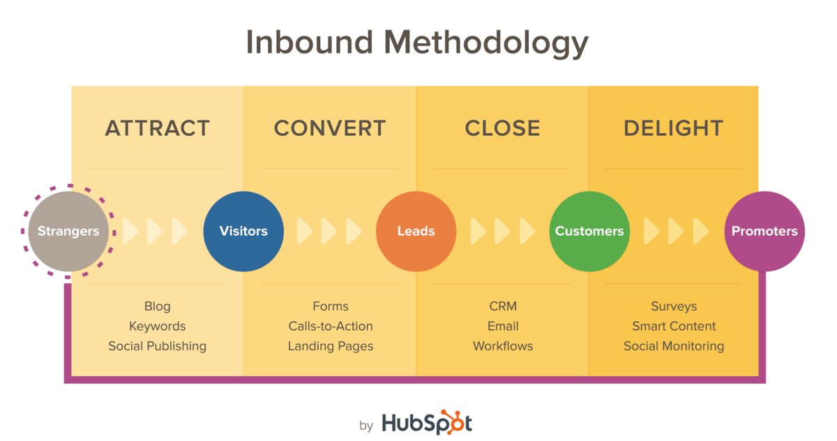
Okay, so the goal is to turn a stranger into a customer. You can blog, you can keyword-optimise your content and index well on Google, and you can publish on social media, but if all people are doing is seeing your content, you’ve missed a big point behind producing it.
Sixty-three percent of B2B marketers cite generating traffic and leads as their biggest challenge. According to the Inbound Methodology, blogs and social media are ways to gain visibility and attract people to your website. If you get 20,000 visitors a month to your website and no leads, that’s redundant data and a lot of wasted time.
What’s most important, then, is the ability to convert these visitors into active leads. It’s your call-to-actions and landing pages that allow you to get to know those site visitors. As they get to know you, too, through the content you provide, they could become paying customers.
The structure of a landing page
Okay, now onto landing pages themselves. There are five essential elements that must be on every landing page:
- Your unique selling proposition (USP)
- The hero shot
- The benefits of your offering
- Social proof
- A single point of conversion (like a form)
Let’s break them down.
Your USP
Your USP is the entire reason a visitor has got as far as your landing page. Without it, you wouldn’t have a website and you probably wouldn’t exist as a business.
Whether it’s the way you speak to your customers in your content, or what it is you’re saying (in all scenarios, strive for both), your USP is the reason a visitor becomes a lead.
For example, marketing platform, Moz, aims to demystify search engine optimisation. They do this on a human-to-human level, producing interesting content like their Whiteboard Friday series. It’s quirky. It’s different.
Here are a few helpful tips for discovering your USP:
- Put yourself in your customers’ shoes. Working out what makes you unique requires you to work backwards. Think like one of your customers, figure out what problems they have, and then solve for those problems.
- Know what motivates your customers’ behaviour and buying decisions. Run customer surveys. Work out your net promoter score and ask yourself why you have the score you do. In short, understand why your customers buy your products. To paraphrase Sun Tzu: To know your customer, you must become your customer.
- Uncover the real reason customers buy your products over a competitor’s. Finally, find out why particular products perform better than others. In this data-driven world, there’s nothing stopping you working out what is and what isn’t converting. Platforms like HubSpot and their partner agencies can help you do just that. Use that data to your advantage.
The hero shot
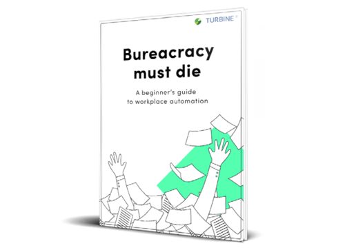
Next on your landing page, you need an image that will turn heads. Resist the lazy option of stock photography, and definitely don’t design some cheap, off-the-cuff clipart image. I’m talking to you, Windows 98 user. Clipart was so last decade.
The hero shot should be more good-looking than your reflection in the mirror. It should be 3D. It should be clean and tidy. It should scream premium. But, more to the point, it should be efficiently designed. Here’s an example from our sister company, Turbine:
The benefits of your offering
Simple, this one. If a visitor gives you their email address and downloads your piece of gated content, what do they get in return?
If you don’t have an answer, your content probably shouldn’t be gated. How will your content help the reader who downloads it? What are you teaching them? What should they expect as an outcome?
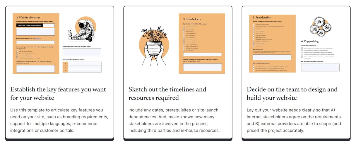
For example, our website specification template helps readers in three ways:
Social proof
I’ll have what Mary’s having. Ninety percent of people are more likely to trust and buy from a brand recommended by a friend.
Use your landing page to showcase some sort of social proof. If someone has actively expressed that they like your premium content, or you show a count of people who have filled in a form, those on the fence will be more inclined to provide their information. Nobody trusts a business, but everybody trusts other customers. Proof really is in the pudding.
A single point of conversion
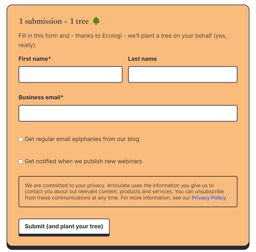
Okay, this is the most important thing to have on a landing page, because without it, you don’t have a landing page.
Your form is your direct point of conversion.
Ask yourself: what information do you require from your leads? In most cases, it’s a first and last name, and an email address. Some businesses want a telephone number. Some occasionally ask for an address (gulp...). In special cases, you might want to ask for more, such as the form on our marketing assessment landing page.
For B2B landing pages specifically, we recommend asking for a work-specific email address. That way you’re not spamming personal inboxes, and people aren't fed up with seeing your business’s name appear on a Sunday morning.
Smart forms — a smart idea
For well-optimised landing pages, you’ll also want to use smart forms. Smart forms let you change what information you can gather from a contact. For example, if someone downloads a white paper twice, and on the first download they gave you their email address, your form will know you have this data, and will ask for, say, a mobile number or company name instead.
Worth considering: video
Okay, before we wrap up, there’s an important statistic you should know that HubSpot discovered in their 2018 State of Inbound report:
Using videos on landing pages will increase conversions by 86 percent.
Video is quickly becoming a cost-effective strategy for many businesses. No longer do companies need a big production budget to produce informative pieces of content that engage with readers and accurately showcase company culture. All you need is a camera, a tripod and a savvy sense of humour. If you want to take your landing pages to the next level and convert more leads, we recommend having a short video on your landing page. Consider this a trailer for your masterpiece.
That's all, folks!
Landing pages are the pillars of a strong inbound marketing strategy. They’re your gatekeepers, your bouncers and your reception desk workers. Nobody gets in or out of your business without them.
If you spend the right amount of time optimising your landing pages for conversions now, your business will be rewarded with more leads in the future. It pays to spend time planning your landing page strategy.
As Abraham Lincoln once put it:
‘Give me six hours to chop down a tree and I will spend the first four sharpening the axe.’


![100+ B2B Lead Generation tips for inbound marketing [2023]](https://www.articulatemarketing.com/hs-fs/hubfs/Blog%20Illustrations/Green/A%20circular%20pattern.jpg?width=400&height=250&name=A%20circular%20pattern.jpg)

