We love iterative improvements when it comes to bettering websites and picking the right website design trends. It’s all part of our master plan to take over the inbound marketing world, step-by-step. There’s a long to-do list, but we’re nothing if not dogged optimists with blinkers on. Recently, we’ve improved our contact page design.
Here’s a breakdown of what we did and why. Maybe these tips will make sense for you and your business, too.
1. Put the key information at the top
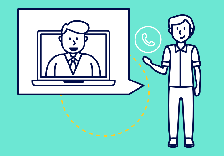
Immediacy and transparency – these two concepts are key when designing a modern B2B business contact page. People want clear information and easy access to it. There’s nothing worse than visiting a ‘Contact Us’ page and struggling to find what you’re looking for.
Whether your potential clients want to book a meeting or just send an email, you should give people the options to choose from, so they can contact your business in their preferred way. You can also further qualify leads with a link to an offer, such as this marketing assessment:

2. Use personalisation for that wow-factor

If your site visitor has already filled in a form to download some sort of premium content, like a white paper on website design, or they’ve subscribed to your blog, you can use personalisation on your contact page. This will grab their attention and give them a tailored experience. It’s a clever touch. And, with HubSpot’s inbound marketing features, it’s dead easy to do.
3. Get right to the point with a ‘book a meeting’ widget
Cut out a step by using a ‘book a meeting’ widget. Instead of making your potential customers contact you to book a meeting – which involves a bit of back-and-forth to set the date and time – they can set up a meeting themselves, hassle-free.
If you have a sales team, set up a team contact calendar to book meetings directly onto the online calendar (such as their Outlook calendar). It’s unbelievably efficient. We use this one.

4. Create some FAQs for those questions oft-asked
Often, people come to a contact page looking for more than just contact information. They want answers. Save time on manually answering questions that come up time and time again by have a ‘frequently asked questions’ section on your website. We’ve put it on our contact page, but you could have these FAQs on a separate page instead.

5. Don’t be afraid to link to further resources
Your FAQs are one way of answering a customer’s questions, but you probably have lots of fantastic resources at your disposal that provide more in-depth answers.

A person may want to spend more time finding out about what you can do for them before they get in touch. By using CTAs, you can direct them to a choice set of resources, which also helps you qualify them as a lead.
It might seem like a strange idea to send people away from the contact page, but don’t worry, if it’s meant to be, they’ll be back.
6. Use anchors to have your cake and eat it, too
You might be thinking, ‘this seems like a lot of stuff to have on one page’ (and there’s more, yet). But, by using anchor points, you really can have it all. These work the same as a hyperlink to another page or site, but instead of taking you elsewhere, they simply send you to another part of the same page.

For example, we have a link that says ‘send a message’ at the top of our contact page. When clicked, this scrolls the visitor to the form that is lower down on the page.
7. Put those customer reviews to good use
92 percent of B2B buyers are more likely to purchase after reading a trusted review. If you have some stellar customer reviews to share (and hopefully you do), then use this powerful tool to persuade visitors to take that next step and contact your business.
Putting reviews on the contact page, and throughout your site, will reassure others that your business is the one they want to work with. As an example, here’s a review from one of our clients:

8. Put that extra effort in the details
Finally, it’s the details that make the difference. Improving your contact page design goes beyond the information you have on it. Use your creativity to delight the eye. Our contact page blends both quirky illustrations with interactive animation. It depends on your brand style, of course, but it pays dividends to have a little fun.

You need to create a contact page that makes people want to talk to you, so welcome conversation with a personable design.
Iterate, improve, impress
Contact page designs – and websites in general – are a constant, iterative process. We’ve made our choices following plenty of research into best practices, but we might decide to change things at a future date based on the data we gather. The good news is, it's already working. Contact pages have a lot of traffic but tend to be exit points. Our page caters to every part of the buyer's journey and we've seen people sign up to newsletters and offers, rather than simply leave forever. That gives us a chance to nurture them into marketing qualified leads.
Have these tips been helpful? Let us know in the comments below. If you want to find out more about how we can help you improve your B2B website and marketing strategy, well… you know where to find us.

We recommend reading these articles, next...

Why accessibility is crucial for website design
Uncover the importance of inclusivity, compliance with regulations, and the benefits of simple,...
5 of the best B2B FinTech websites
Learn from the best of the best FinTech websites, and discover how you, too, can have a stunning...
What makes a simple website vs a complex or large website?
You need a new website. But do you need to pay for a complex or large site build, or does your...